Chart Types in Technical Analysis| Chart Types| Technical Analysis Charts| Candlestick Chart| Bar Chart| Line Chart| Stock Market Charts| Trading Basics| Price Action
Learning Outcome: Line, Bar, Candlestick Charts
🎯 Key Takeaway: Charts help visualize price movements
Introduction
In the previous lesson, you learned about technical analysis and how it helps in understanding market behavior. Now it’s time to focus on the most important tool used in this method — charts.
Charts are the backbone of technical analysis. They transform raw price data into a visual format that is easy to understand and analyze. Instead of looking at numbers, traders look at charts to identify trends, patterns, and opportunities.
Every movement in the market reflects the actions of buyers and sellers. These actions are captured and displayed through charts. Whether the market is rising, falling, or moving sideways, charts help you see the complete picture.
Different types of charts provide different levels of information. Some are simple and useful for beginners, while others give deeper insights into price behavior.
In this lesson, you will learn the three most important chart types:
- Line Chart
- Bar Chart
- Candlestick Chart
Understanding these charts is the first step toward mastering technical analysis.
🧠 What are Chart Types in Technical Analysis
Chart types are different ways of representing price movement over time. They help traders understand how a stock has behaved in the past and how it might behave in the future.
A chart shows:
- Time on one side
- Price on the other side
By combining these two elements, charts create a visual representation of market activity.
Charts simplify complex data and make it easier to:
- Identify trends
- Spot patterns
- Make decisions
Different chart types display different levels of detail. Some focus only on closing prices, while others show complete price movement including open, high, low, and close.
Choosing the right chart depends on your trading style. Beginners often start with simple charts, while experienced traders prefer detailed ones.
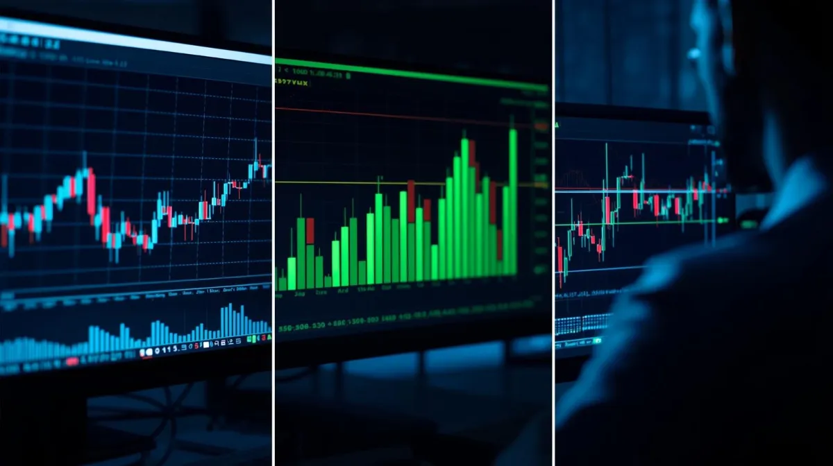
📈 Line Chart
A line chart is the simplest form of chart used in the stock market. It is created by connecting the closing prices of a stock over a period of time.
This chart provides a smooth and clear view of the overall trend. It helps you quickly understand whether the stock is moving upward, downward, or sideways.
Line charts are best for:
- Identifying long-term trends
- Getting a simple overview
- Comparing multiple stocks
Because it only uses closing prices, it removes unnecessary noise and focuses on the bigger picture.
However, this simplicity also comes with a limitation. Line charts do not show detailed price information like opening price, highest point, or lowest point during the day.
Even with this limitation, line charts are a great starting point for beginners who want to understand market direction without complexity.
📊 Bar Chart
A bar chart provides more detailed information than a line chart. It shows four important price points:
- Opening price
- Closing price
- Highest price
- Lowest price
Each bar represents a specific time period and gives a complete picture of how the price moved during that time.
Bar charts are useful for:
- Understanding price range
- Measuring volatility
- Analyzing short-term movement
They help traders see not just where the price closed, but how it behaved throughout the session.
However, bar charts can be slightly complex for beginners. It takes some practice to understand how to read them correctly.
Once mastered, bar charts provide valuable insights into market activity.
📊 Candlestick Chart
Candlestick charts are the most popular and widely used charts in technical analysis. They present the same information as bar charts but in a more visual and easy-to-understand format.
Each candlestick represents a time period and shows:
- Opening price
- Closing price
- High price
- Low price
The body of the candle shows the difference between opening and closing price, while the thin lines show the highest and lowest levels.
Candlestick charts are powerful because they visually represent market psychology.
They help traders:
- Understand buying and selling pressure
- Identify patterns
- Spot trend reversals
Because of their clarity and effectiveness, most traders prefer candlestick charts for decision-making.
⚖️ Line vs Bar vs Candlestick
Each chart type has its own strengths and purpose.
Line charts are simple and easy to understand. They are best for beginners and for identifying overall trends.
Bar charts provide more detailed information and help in analyzing price movement more deeply.
Candlestick charts combine detail with visual clarity, making them the most powerful and widely used option.
Most professional traders prefer candlestick charts because they make it easier to understand market behavior and take quick decisions.
🧠 Real Market Perspective
In real trading, charts are more than just visuals. They reflect the behavior of market participants.
For example:
- A strong upward move shows buying interest
- A sharp fall shows selling pressure
Charts help you understand what the market is doing without relying on news or opinions.
Instead of guessing, you start observing and analyzing.
This approach improves decision-making and reduces emotional mistakes.
💡 Practical Beginner Strategy
To start using charts effectively, follow a simple approach.
First, use line charts to understand the overall trend.
Second, switch to bar charts to learn how price behaves during a session.
Finally, focus on candlestick charts to identify patterns and improve timing.
This step-by-step method builds strong understanding and confidence.
🧠 Golden Rule
The better you understand charts, the better your market decisions become
🧠 Final Summary
Charts are the foundation of technical analysis. They convert price data into meaningful insights that help traders understand market behavior.
In this lesson, you learned:
- Line charts are simple and useful for trend analysis
- Bar charts provide detailed price information
- Candlestick charts offer the best visual understanding
Each chart type plays an important role, but mastering candlestick charts gives you a strong advantage.
Once you become comfortable with charts, you will start seeing opportunities that others miss.
❓ FAQs
Which chart is best for beginners
Line chart is best for beginners
Which chart is most used by traders
Candlestick chart is most widely used
Why are charts important
They help understand price movement and trends
Can charts predict the future
No, they help analyze probability, not certainty
📣 Engagement Section
Which chart do you prefer — line, bar or candlestick
Comment below 👇
🔥 Closing Line
Charts don’t just show price they reveal the story behind every move
Chart Types in Technical Analysis| Chart Types| Technical Analysis Charts| Candlestick Chart| Bar Chart| Line Chart| Stock Market Charts| Trading Basics| Price Action
📌 Final Affiliate CTA
Start trading with professional order types, GTT automation and Mini brokerage
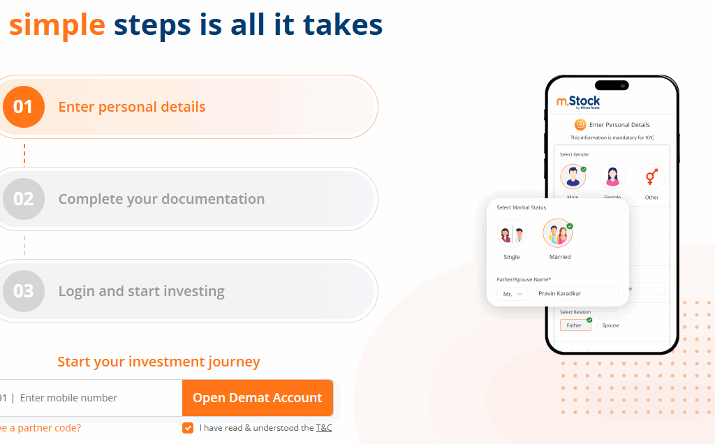
👉Open Your mStock Demat Account: Click Here
Course Introduction:
Open Demat Account
by Mirae Asset (m,Stock)

-
The Great Lockdown: Iran’s Strategic Halt of Food Exports in 2026
Iran Food Export Ban| Iran Agricultural Halt 2026| Middle East Food Security Crisis| Iran Domestic Supply Protection| Iran Food Export…
-
Iran-Israel War: Unpacking “Operation Lion’s Roar” and its Ripple Effect on Global Markets – A Deep Dive for Indian Investors
Iran-Israel War Market Impact| Operation Lion’s Roar update| Effect of Iran war on Nifty 50| Crude oil price surge 2026|…
-
The Tariff Tussle: Decoding the Legal Challenge to Executive Trade Power
Supreme Court| Tariffs| Trade War 2026| Donald Trump| IEEPA| Section 301| US Economy| Import Duties| Constitutional Law| Reciprocal Trade Act…
-
The 2025-26 Market Journey: From All-Time Highs to the “Retail Trap” Panic
Indian Stock Market Performance 2025-26| Nifty 50 Returns FY26| Why is Market Falling Feb 2026| Hold or Sell Indian Stocks|…
-
Indian Stock Market Update Feb 20: Nifty Reclaims 25,550, Sensex Jumps 316 Pts Amid Global Cues
Indian Stock Market Update Feb 20| Nifty 50 today| Sensex closing| Top gainers and losers Market Snapshot: The Bulls Fight…
-
Indian Stock Market Today: Bulls Charge Ahead as Sensex and Nifty Rally on Banking & IT Strength
# Indian Stock Market Today: Sensex and Nifty Close Higher Amid Broad-Based Buying ## Indian Stock Market Report – Updated…